Our latest contribution from Sleek Magazine Berlin.
Painting in three dimensions while reframing art history.
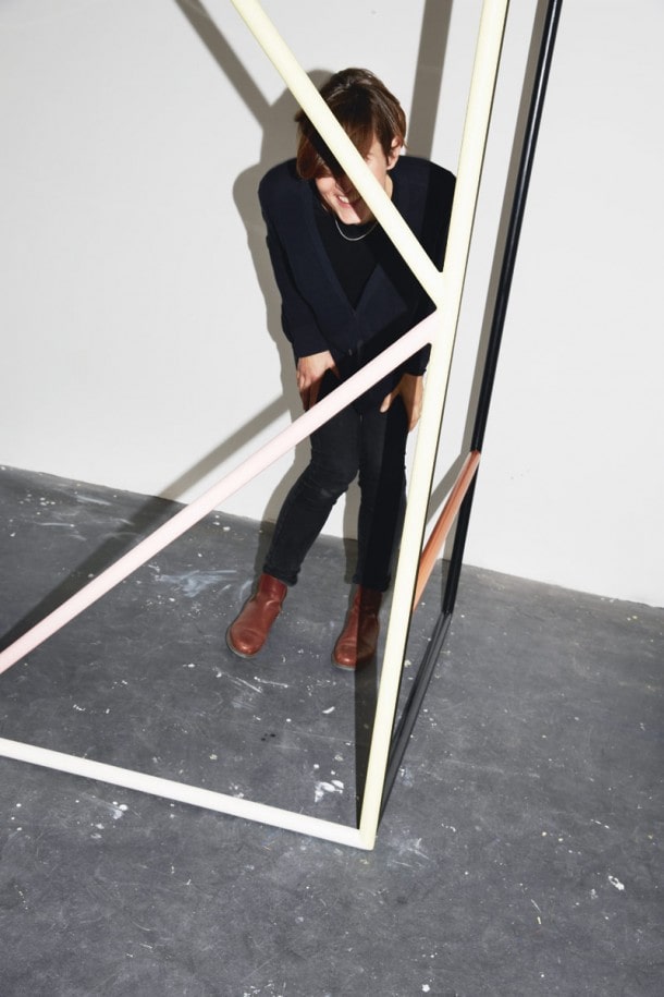
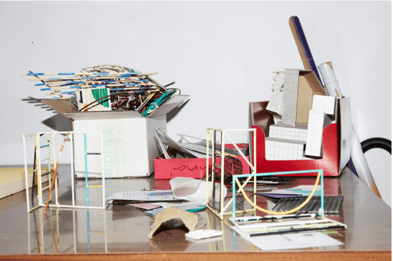
Given that she usually works in series of six or seven, it comes as no surprise that Eva Berendes’ two most recent works are named after days of the week – “Untitled (Monday & Tuesday)”, 2013. “I tend to do that number because it’s just how long I can keep myself interested, and come up with that number of variations.” She calls herself a painter “in the expanded sense”, and it’s clear from these two works that now sit in her studio space when Sleek visits are not what most people would immediately identify as paintings – being inspired by children’s climbing frames. She cites her interest in the body’s engagement with abstract shapes as a motivation for her work, and notes that it could herald a shift in her practice towards outdoor, public works – pieces standing in the rain just like the objects they’ve been inspired by. People in turn seem keen to get up close to Berendes’ work, engaging in a physical, tactile way; often they involve layered, translucent elements and thus invite 360-degree viewing.
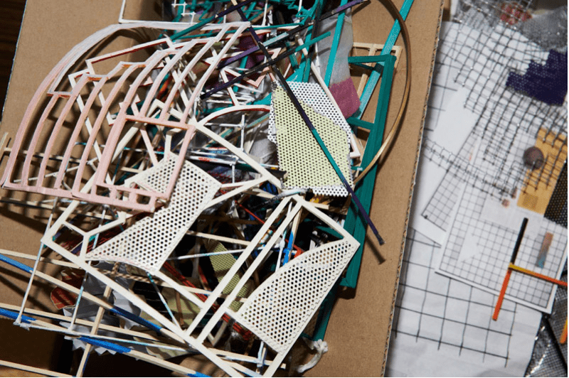
It was at the beginning of her career, in work for her MA show, that Berendes began engaging with the more physical aspects of abstract painting: “I had a tie-dyed canvas and I put it on the stretcher, but it didn’t seem right to have that organic thing there – how do I know what is the right size and why is it in that position?” The relation to design is particularly relevant in considering her influences– most notably postmodern Memphis furniture and Russian Constructivism. In this way, she sees her work as contributing to and a modification of a shared language: “I’m not hiding myself in a very personal, hidden discourse, or influences that no one has ever heard of. I’m trying to participate in a bigger story. I am aware that I’m sharing a language with other people, which makes me feel more like I’m part of an ancestry.”
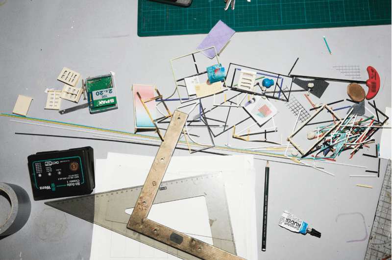
Sleek asked Eva Berendes how she feels about seeing elements of this design language used in other contemporary settings – the similarity between the metal grids used to show products on American Apparel’s walls for example, and Berendes’ “Grid” series, where an umbrella, a tennis racket and a gradient-dyed canvas are all displayed seemingly at random on steel frameworks. “I haven’t noticed it so much. As soon as I start working on something I see it everywhere regardless. I could see that more as a sign that artists and designers and perhaps musicians and so on, all pick up on the same influences.”
Nevertheless, there is clearly a reason why Eva Berendes chooses older applied art and design language to reinterpret and put her own spin on. “If it’s a bit older I find it easier to understand. I’m not so tied up in it and it’s not changing so much. It ages at a different speed.” While she’s not convinced that movements she is influenced by, such as postmodernism, are truly “over” (“Has it really been recognised and appreciated for its good sides?”), she confesses her own desire to see something contemporary reappropriated in some way, taken through a development that shows the artist’s hand. “You have to send it through some sort of process, it’s not enough to just quote it.”
Berendes feels like she is working to the same beat of the artistic community as a whole. She mentions the small nods and shrugs artists give each other at openings as an example of this mutual understanding. “You realise that you mean the same thing and you’re not alone in what you do.” What a comforting thought.
